
5 Ways Custom Keyboards Improve Desk Aesthetics
[ Back to Mechanical Keyboards 101 ]A custom keyboard can change how your whole desk looks. Since it sits in the center of your setup, it affects color, spacing, materials, and lighting more than most other gear.
Here’s the short version:
- The keyboard becomes the visual center of the desk
- Keycaps set the color theme and mood
- Case material changes the look through texture and finish
- Smaller layouts free up space, with 60% boards around 11.5–12 inches wide and full-size boards often 17–18 inches
- Matching extras like a deskmat, cable, and soft lighting make the setup feel more put together
A few details matter most: case color, keycap set, layout size, and a small number of matching accessories. For example, a 75% layout gives you a compact look without giving up as many keys, while PBT keycaps often keep a matte look longer. If you want a cleaner desk, starting with the keyboard is one of the simplest moves.
AESTHETIC Mechanical Keyboard Collection | sound tests & my desk setup
sbb-itb-3cb9615
Quick comparison
| Part | What it changes | Simple takeaway |
|---|---|---|
| Keyboard case | Main look and desk presence | Aluminum looks clean; acrylic softens RGB; wood adds warmth |
| Keycaps | Color theme and style | Use keycaps to guide the rest of the setup |
| Layout | Open space on the desk | 60% looks the cleanest; 75% is a strong middle ground; TKL keeps more familiar keys |
| Accessories | Final polish | Match the deskmat, cable, and lighting to the keyboard |
If I were setting up a desk from scratch, I’d start with the keyboard first, then match everything else to it.
Why Custom Keyboards Matter for Desk Style
Desk style comes down to a few simple things: color, balance, texture, lighting, and your own taste. When those parts work together, the desk looks intentional. When they don’t, the whole setup can feel a bit off.
Standard office keyboards aren’t made with that in mind. They’re built to look the same almost everywhere, not to match one specific desk.
That’s where a custom mechanical keyboard changes things. You get control over the keycaps, case, layout, and accessories, which makes it much easier to match the board to the desk instead of letting it fight for attention. A silver aluminum case can look clean and modern. A matte black case can disappear into a darker setup. Pastel keycaps can sit nicely in a soft, minimal palette.
The 60/30/10 color rule works well here: the desk or desk mat acts as the base, the keyboard becomes the secondary block, and smaller accessories bring in the accent.
That’s the main shift. A custom board can feel like part of the desk’s design language, not just a generic object dropped on top of it. And that visual base starts with the keyboard itself.
1. A Custom Keyboard Creates the Desk's Visual Anchor
A keyboard sits right in the middle of the desk. That means its case, keycaps, and layout do a lot of the visual heavy lifting. Once you’ve picked your desk palette, the keyboard often becomes the piece that ties the whole setup together.
Visual Impact
A custom board from KeebsForAll gives you space to shape the look of your desk through case color, keycap colorway, and layout format. Instead of fading into the background, the keyboard can become the part your eye goes to first. For example, a 65% board with pastel PBT keycaps and a minimalist black on white keycaps or a frosted acrylic case creates an instant focal point.
Theme Cohesion
The Pink Robin series pairs matching keycaps and deskmats into one clear theme. That kind of matching makes it much easier to keep the whole setup locked into a single color palette, rather than looking pieced together.
Material Presence
Case material changes how much visual weight the keyboard has on the desk. Anodized aluminum cases add a solid, premium look that fits well with metal monitor arms or laptop risers. Polycarbonate or frosted acrylic cases soften RGB lighting into a gentler glow, which looks especially good on glass or light wood surfaces. Thick PBT keycaps resist shine and help the board stay clean-looking for longer.
Desk Footprint
Layout size has a direct effect on how open or cramped a desk feels. A 60% board is about 11–12 inches wide, while a full-size keyboard can stretch to 17–18 inches. Going with a compact layout like the Freebird60 or Freebird75 opens up surface space on both sides, which helps the desk feel more balanced. From there, keycaps and finishes can push the theme even further.
2. Custom Keycaps Set a Clear Desk Theme
If the case sets the frame, keycaps set the tone. They shape the main color palette on your desk, and swapping a set can shift the whole mood in one shot.
Visual Impact
Accent keys, font style, and profile shape all change how bold or stripped-back a board feels. Sculpted profiles give the keyboard more presence. Low-profile caps sit flatter and fade into a cleaner, more minimal setup. Themed sets like GMK CYL Shashin show how monochrome keycaps can define a desk without leaning on bright colors.
Theme Cohesion
The best-matched setups often start with the keycaps and build from there. Use the keycap palette as the guide for the rest of the desk. That means your deskmat, cable, and even small accessories can follow the same color story. KeebsForAll's Pink Robin series is a good example, with a coordinated palette that carries from the keyboard to the deskmat.
Material Presence
PBT keycaps tend to keep their matte look longer, which helps the board stay clean-looking over time. ABS doubleshot sets usually offer brighter color and a smoother finish, so they work well for a bold, high-contrast desk. Premium ABS doubleshot sets can cost $120–$200+.
Visual Density
A restrained two- or three-color palette helps the keyboard stand out without fighting the rest of the desk. One or two artisan keys can add personality without making things feel crowded.
Once the color story is set, case material and finish shape whether the board looks more polished or more soft.
3. Case Materials and Finishes Change How a Keyboard Looks
After keycaps set the color story, the case sets the frame.
Visual Impact
Case material changes the whole vibe of a keyboard.
Aluminum cases usually give off a premium, clean look. The lines feel crisp, and finishes like anodizing or powder coating help the board look polished and consistent. Plastic and polycarbonate cases come across as lighter and more casual. Acrylic shifts attention to RGB lighting and the parts inside the board. Wood cases bring grain, texture, and warmth, which makes the keyboard feel more handcrafted.
Theme Cohesion
The case should fit the rest of the desk, not feel like it was dropped in at the last minute. When the material lines up with your monitor, mouse, desk mat, or furniture, the setup feels pulled together.
Material Presence
Material also affects how much visual weight a keyboard has.
Heavier materials tend to make a board look more grounded. Aluminum cases feel dense and steady on a desk. Thick acrylic cases make more of a statement because they look like solid blocks of material. Wood cases add clear heft too, but without seeming oversized.
Finish and Upkeep
Finish matters more than people think, especially day to day.
Anodized and powder-coated aluminum usually hide fingerprints better than glossy plastic or clear acrylic. If you want a board that still looks sharp without constant wiping, matte aluminum and frosted acrylic are easier to live with. Glossy finishes can look great in photos, but they tend to show smudges much faster.
Once the case sets the tone, layout size becomes the next factor in how open the desk feels.
| Case Material | Best Desk Theme | Finish Options |
|---|---|---|
| Aluminum | Minimalist, modern, office | Anodized, powder-coated, brushed |
| Plastic/Polycarbonate | Casual, colorful, budget-friendly | Matte, glossy, frosted |
| Acrylic | Gaming, RGB-heavy, futuristic | Clear, frosted, layered |
| Wood | Warm, cozy, natural, retro | Oiled, stained, lacquered |
4. Compact Layouts Keep Desks Looking Clean and Organized
Once the case material sets the mood, the keyboard’s size has a big effect on how open the desk feels.
Desk Footprint
A 60% or 75% layout frees up desk space and makes the whole setup feel lighter.
Visual Impact
Smaller boards cut visual clutter. A 60% layout removes the function row, navigation cluster, and numpad, which leaves you with a tight, clean rectangle. A 75% layout keeps the function row and arrow keys, but fits them into a tighter frame, so the board still looks compact without feeling sparse.
That smaller shape also leaves more negative space around the keyboard. And that changes the whole desk. Instead of looking crowded, the setup feels more deliberate and put together.
Theme Cohesion
A compact keyboard supports the rest of the setup instead of taking over the scene. That gives the mouse, lamp, and themed deskmat room to work together, so the desk feels like one composition instead of a pile of separate parts.
Material Presence
Compact doesn’t mean visually light. A 60% board built with an aluminum case or brass plate can still feel substantial and high-end on the desk - it just does it without the bulk.
| Layout | Desk Footprint | Best Aesthetic Use Case |
|---|---|---|
| 60% | Smallest footprint | Ultra-minimalist; maximizes open desk space |
| 75% | Compact footprint | Balanced; compact look with function-row access |
| TKL | Larger footprint than 75%, but still cleaner than full-size | Traditional; cleaner than full-size without the numpad |
Choose the smallest layout your workflow allows. Once the footprint is set, accessories and lighting can finish the look.
5. Matching Accessories and Lighting Pull the Setup Together
Once the keyboard footprint is set, accessories and lighting become the final layer. A deskmat, cable, and light source finish the desk and make it feel intentional. They turn a group of parts into a desk setup that looks planned.
Visual Impact
A matching deskmat frames the keyboard, anchors the mouse, and gives the setup a clear base. That helps the keyboard become the main visual anchor for the rest of the desk.
A coiled USB-C cable can add color and texture without eating up extra desk space. Small detail, big effect.
Theme Cohesion
Accessories should echo the keyboard, not fight for attention. A simple way to do that is to pick one main color and one accent color, then repeat them across the setup.
Instead of using rainbow lighting, carry one accent color through the keycaps, cable, and lighting. Set the keyboard's RGB to static lighting in that accent color, then add a backlight behind the monitor for a soft, diffuse glow that supports the palette without harsh hotspots.
Material Presence
Texture layering can make the desk feel more deliberate. A cloth deskmat, aluminum case, braided cable, and wooden wrist rest create clean contrast without making the setup feel busy.
Desk Footprint
Keep the keyboard and mouse inside the deskmat's edge to make the surface look simpler and more controlled. For lighting, one or two well-placed sources usually look better than several scattered RGB elements.
A backlight behind the monitor and subtle keyboard underglow can give the desk a cleaner look than multiple lights all trying to stand out at once.
The comparison tables below show which materials and layouts fit each aesthetic.
Case Material and Layout Comparison Tables
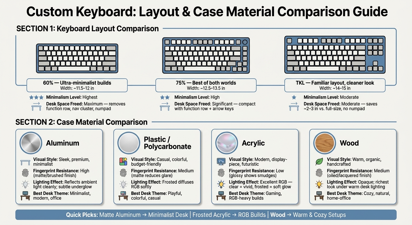
Custom Keyboard Layouts & Case Materials: Desk Aesthetics Comparison Guide
Now that the desk theme is set, these tables make the last material and layout choice much easier. You can scan them and compare case material, lighting, and footprint in a few seconds.
Case Material Comparison
| Case Material | Visual Style | Texture | Lighting Effect |
|---|---|---|---|
| Aluminum | Sleek, premium, and professional; a strong fit for minimalist or neutral setups | Smooth and cool to the touch; brushed or matte finishes help hide fingerprints | Reflects ambient light cleanly and works well with subtle underglow |
| Plastic (ABS or Polycarbonate) | Simple and utilitarian, with plenty of color options for playful or budget-conscious builds | Smooth to lightly grippy; matte finishes reduce glare and feel less cold than metal | Translucent polycarbonate can diffuse RGB softly, while opaque plastic absorbs more light |
| Acrylic | Modern, display-piece aesthetic; clear or frosted finishes stand out on the desk | Smooth, with frosted acrylic reading softer visually than glossy acrylic | Excellent for RGB - clear acrylic makes lighting vivid, while frosted acrylic creates a softer ambient glow |
| Wood | Warm, organic, and handcrafted; a great match for cozy home-office setups | Natural grain variation and a warmer feel than metal | Opaque and light-absorbing, with the richest look under warm desk lighting |
A few quick takeaways: matte aluminum looks right at home on minimalist desks, frosted acrylic pairs nicely with RGB-heavy builds, and wood tends to look best next to natural materials.
After finish and lighting, footprint is the next call.
Layout Comparison
| Layout | Approximate Width | Minimalism | Desk Space |
|---|---|---|---|
| 60% | About 11.5–12 in | Highest; a clean rectangular block with no extra clusters | Maximum; frees several inches compared with a full-size board |
| 75% | About 12.5–13.5 in | High; compact, but still includes a function row and arrow keys | Significant; slightly less open than 60%, but still much smaller than TKL |
| TKL | About 14–15 in | Moderate; familiar and traditional without the numpad | Moderate; saves roughly 2–3 in of width compared with full-size |
If you want the most open desk look, go with 60%. If you want a middle ground, 75% is the sweet spot. TKL makes more sense if you still want those familiar navigation keys close at hand.
Start with the layout, then pair the case material with your lighting and décor.
Where to Shop for a Coordinated Desk Setup
Once you’ve picked your layout and materials, the next step is simple: find the parts in one place so the setup doesn’t turn into a mix-and-match mess.
KeebsForAll stocks custom keyboards, keycaps, switches, deskmats, and accessories, which makes it a lot easier to keep the whole desk looking pulled together.
The Freebird60 starts at $165.00, the Freebird75 at $199.00, and the Freebird TKL at $249.99. All three use aluminum cases with an electrophoresis coating, which gives them a smooth finish that looks clean on almost any desk setup. After that, keycaps and a deskmat are what tie the look together.
If you want the same color palette to carry past the keyboard itself, matching keycaps and a deskmat do the heavy lifting. KFA carries themed keycaps like kfaPBT Cardinal ($78.00) and kfaPBT Forest Watcher ($95.00), along with deskmats priced from $8.99 to $27.00. And if you’re in the U.S., domestic orders over $70.00 ship free.
There’s also KFA Marketplace, which lists assembled secondhand custom keyboards from third-party sellers. That’s a nice lane for anyone who wants a ready-made option without building from scratch.
Conclusion
The takeaway from those five details is pretty simple: a custom keyboard does more than sit on your desk. It sets the tone for the whole setup. It becomes the visual anchor that pulls everything else into place.
The keyboard, keycaps, case, layout, and accessories work together to create one desk look.
A personalized workspace feels more intentional. And that's the whole point of a custom board.
A simple way to start is with one board, then shape the rest of the desk around it. You might begin with a custom build or a secondhand assembled board from KeebsForAll's KFA Marketplace. Either way, the aim is the same: a desk that feels like it was set up for you, not just pieced together from whatever was on hand.
That’s what separates a designed desk from a generic one.
FAQs
Which keyboard layout is best for my desk?
The best layout comes down to two things: how much desk space you want and what feels good to type on.
Compact boards like 60% free up more room on your desk. That can be a big deal if you use a low mouse sensitivity or just like a cleaner setup. TKL, on the other hand, feels closer to a standard keyboard since it keeps dedicated navigation and function keys.
If comfort is your top concern, ergonomic layouts like Alice, Arisu, or ortholinear may help reduce wrist strain. You can also remap keys or set up programmable layers so the keyboard fits the way you work, not the other way around.
Do custom keycaps really change the overall look?
Yes, custom keycaps can change how a keyboard looks in a BIG way.
They give your board more personality with custom colors, fonts, and designs instead of the plain, mass-produced look that many stock keycaps have.
Swap out the standard caps, and your keyboard can line up better with your desk setup. It can also go from looking generic to feeling like a personal centerpiece.
What accessories should I match with my keyboard?
Match your keyboard with accessories that fit its color scheme and overall look, such as:
- a desk mat for color, texture, and protection for your workspace
- a custom cable to pull the setup together
- a wrist rest for comfort and a balanced look
- artisan keycaps for a personal touch